3 Common Mistakes Brides Make When DIY’ing a Chinoiserie Wedding
(and How to Avoid Them)
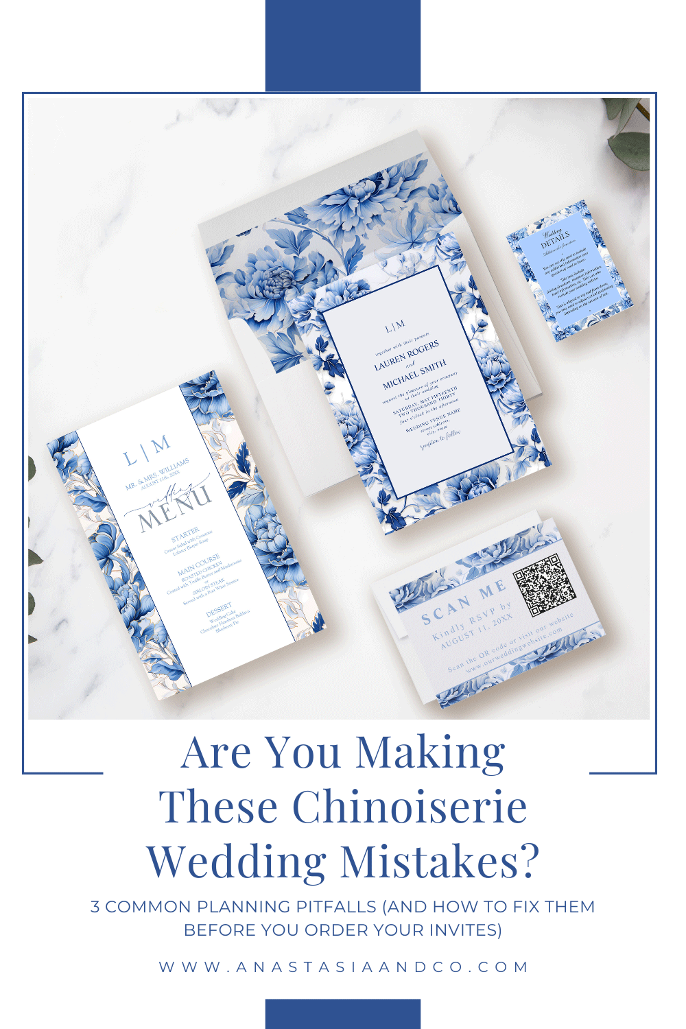
Have you seen designs like this? We sure have! But we didn’t want to make anyone feel bad, so we intentionally designed a bad Chinoiserie suite, to illustrate the point.
It all begins with an idea.
Maybe you’re dreaming of a Chinoiserie bridal shower. Or perhaps you’re planning a wedding inspired by French Toile or blue-and-white porcelain.
Whatever your vision, one thing is certain: the way you tell your story—through your event and your invitations—makes all the difference.
For many brides, Chinoiserie is love at first sight—elegant florals, intricate patterns, and that timeless blue-and-white palette. It feels refined. Personal. Beautifully different.
But when it comes time to design the actual invitations, things can start to feel… murky.
You’ve saved the inspo, picked the colors, maybe even found a template that seems close.
And yet, the final design doesn’t quite feel like it fits.
Not because you lack good taste—but because you were never given the tools to translate your vision clearly.
Mistake #1: Overloading the Palette
Let’s be real—this usually comes from a place of excitement.
You love the Chinoiserie look. You’ve been saving toile linens, ginger jars, and those gorgeous blue-and-white invitation suites for months. And somewhere along the way, it starts to feel like more equals better.
What this mistake looks like in the full wedding picture:
Toile table linens plus floral Chinoiserie plates plus a printed menu with matching patterns plus a toile-wrapped table number...
Painted pumpkins on the table (because it’s fall), layered next to blue-and-white vases, custom napkins, and chinoiserie placecards
Everything is beautiful—but nothing stands out. It’s a visual overload, and your guests can’t tell where to look.
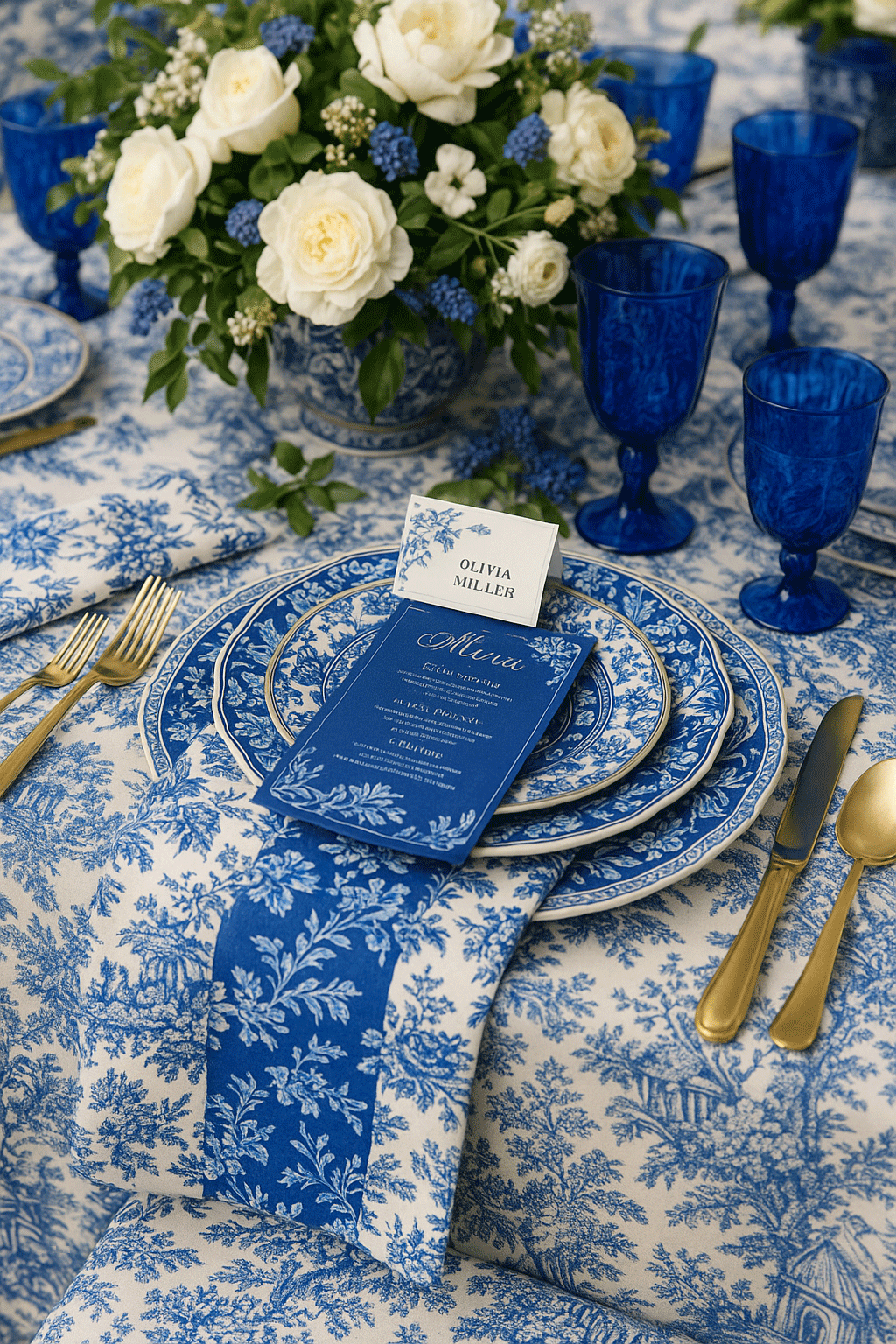
An intentionally created AI image depicting overloading the palette, a common mistake brides make when planning a Chinoiserie wedding
In the invitations, it shows up like this:
A busy border, a full floral background, a toile envelope liner, and a separate design on the RSVP
Multiple shades of blue competing for attention
Inserts that feel disconnected from one another—even though they’re meant to be a set
And suddenly, the suite doesn’t feel refined. It feels heavy.
Why you might be doing this (and why that’s okay):
You want your wedding to feel meaningful. Every element you’re choosing has a reason—it reminds you of your vision, your story, or something you saw that felt right. You don’t want to leave anything out. You want guests to walk in and feel surrounded by intention.
But here’s the truth: when everything is emphasized, nothing is remembered.
Why it’s not your fault:
No one teaches brides how to filter their vision.
Pinterest loves abundance. Design platforms reward more. Templates and color palettes are endless—but you’re never shown how to edit. And without a trusted process, it’s easy to layer until the meaning gets lost under the decoration.
What changes when you take a different approach:
When you start with a Vision Translation Board™, you get clarity before you commit to anything. You’ll know which blue speaks to your style, and which pieces actually belong in your design. The menu, the placecard, the invitation—all of it flows because it comes from the same visual root.
The result is elegant, personal, and powerful.
Guests don’t just see “a lot of pretty things.”
They feel your story—because nothing is competing with it.
Mistake #2: Mixing Styles Without a Vision
This is one of the easiest mistakes to make—especially when you have great taste.
You see so many beautiful things, and naturally, you want to bring them all together.
But without a clear, guiding vision, it’s incredibly easy to mix elements that don’t actually belong in the same story.
What this looks like across your wedding:
A blue-and-white Chinoiserie plate set on a rustic farm table, next to rattan chargers and French lace napkins
Garden florals in vintage chinoiserie vases—but styled next to black tapered candles for “contrast”
A toile-wrapped menu paired with a romantic calligraphy place card and a clean, modern acrylic table number
Every single element is beautiful on its own. But together?
The styles are pulling in different directions. It doesn’t feel cohesive—it feels confusing.
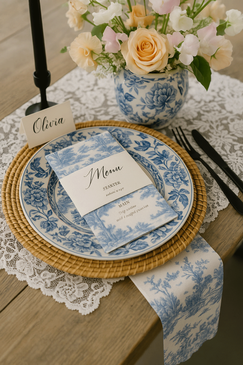
An intentionally designed AI image depicting a Chinoiserie wedding without a cohesive vision, made in AI so as not to embarass anyone. Chinoiserie isn’t just blue and white, there are at least 3 different Chinoiserie styles in this image, each one unique.
In your invitations, it might show up like this:
A formal monogram crest with an ultra-casual script font
A chinoiserie border paired with botanical clipart from a different style altogether
An elegant invitation backed with a rustic RSVP card, or a modern details insert
There’s no harmony. And even though everything technically “matches” the color palette, it doesn’t feel like it came from the same designer—because it didn’t. It came from bits and pieces, assembled without a framework.
Why brides do this (and why it makes sense):
Because you’re not just copying Pinterest boards—you’re trying to design from what feels right.
And sometimes, what you love spans multiple styles. You might love French countryside and chinoiserie and classic garden weddings. It’s normal to feel drawn to more than one look.
Chinoiserie is rich in history and symbolism. When used meaningfully, it feels elevated and personal. When copied, it risks becoming shallow.
Why it’s not your fault:
You were never shown how to translate a feeling into a design.
Most planning advice focuses on tasks, not tone. And design tools let you grab whatever looks good in the moment—but they don’t teach you how to step back and see the bigger picture.
So you’re layering without realizing you’re mixing design languages that don’t naturally speak to each other.
What happens when you have a clear vision instead:
When you start with a Vision Translation Board™, you define your style before you make decisions. You don’t have to guess whether toile and rattan go together—you’ll already know whether they belong in your story.
This doesn’t mean giving up things you love.
It just means choosing the right elements for this wedding—so everything feels consistent, elegant, and unmistakably yours.
When your vision is clear, your design choices start supporting one another. And that’s when the magic happens.
Use your relationship story or family heritage to guide visual choices
Add meaningful elements: a monogram crest, a favorite quote, subtle iconography
If Chinoiserie is an aesthetic preference, honor it—but don’t let it replace your voice
Mini case study or anecdote:
How a bride used a Zazzle suite but added a floral element that mirrored her ceremony arch—making it hers.
Mistake #3: Copying What’s Trending Instead of Expressing What’s True
This one stings a little—because we’ve all done it.
When you’re planning a wedding, there’s this pressure to get it “right.” So you look around at what other brides are doing. You scroll Pinterest, you save screenshots, and before long, you’re recreating what’s popular... because it already looks like it works.
But the thing is—it doesn’t always work for you.
What this looks like on the wedding day:
You chose Chinoiserie because it’s elegant—but you’re getting married in a vineyard, and the aesthetic feels a little out of place
The blue-and-white theme is everywhere, but you’re also adding “something blush” because Pinterest told you it softens the look
Your signage matches the trend, but not the venue. Your welcome sign feels polished, but your guestbook table feels rustic. Nothing feels bad—it just doesn’t feel right
And in your invitations? It shows up like this:
A stunning blue toile suite that looks just like the one from Instagram—but somehow feels generic
A design that’s objectively beautiful, but leaves you with a quiet feeling of: “This doesn’t really feel like us.”
Paper that doesn’t reflect your tone, your season, your ceremony space—or the kind of wedding you’re actually having
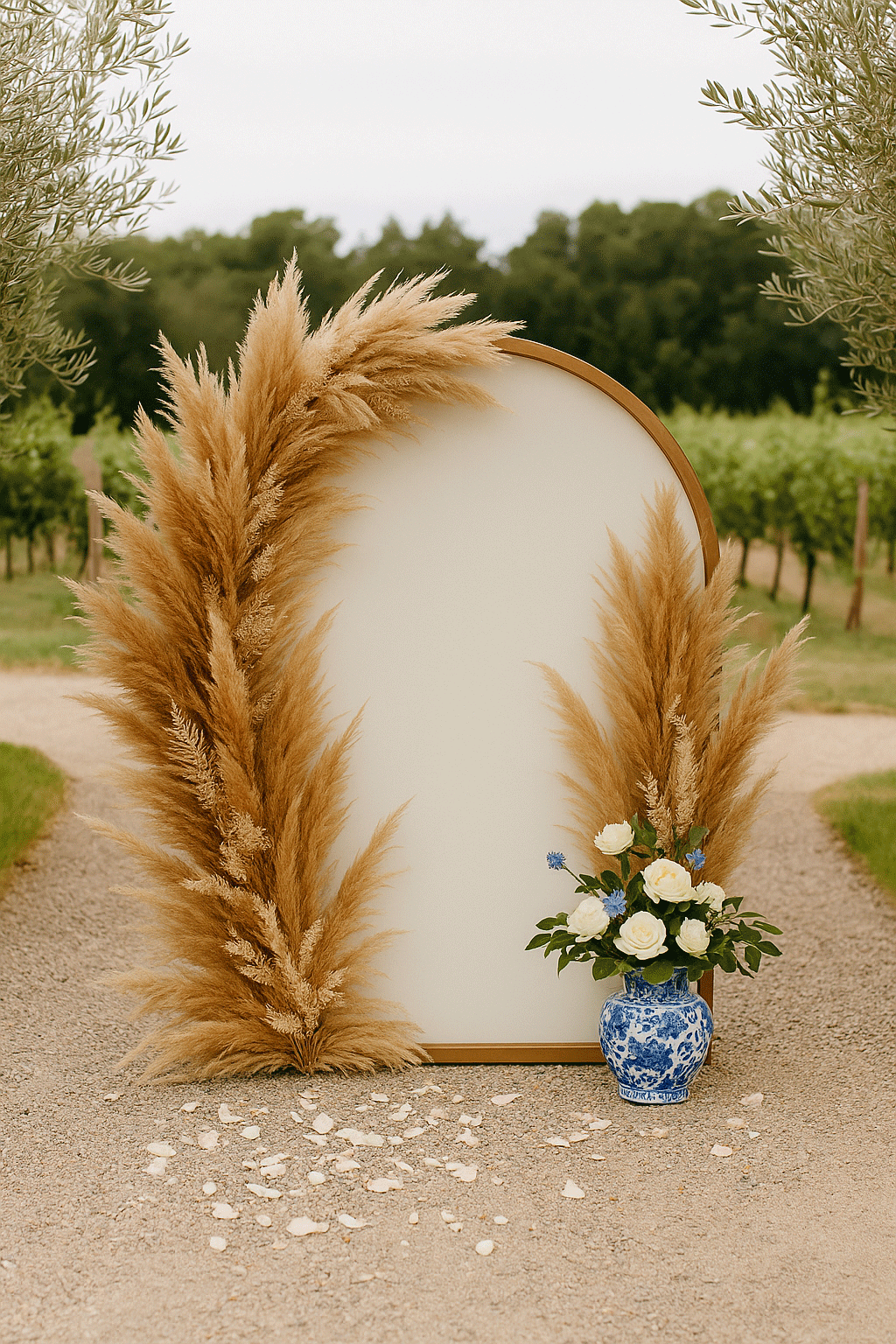
An intentionally generated AI image illustrating the mistake brides make when they follow trends in planning their wedding, instead of planning to a vision that’s right for them.
Why you’re doing it (and why it’s completely valid):
You want something elevated. You want your wedding to look beautiful in photos, and maybe part of you just wants the reassurance of knowing you’ve chosen something safe. Something “approved.”
There’s comfort in what’s already been done—and there’s nothing wrong with that.
You use a checklist model: invitations, then signage, then favors
You’re not using a unifying vision, just reacting to each decision
Your final mood board and invitation suite is pieced together, not designed from a core
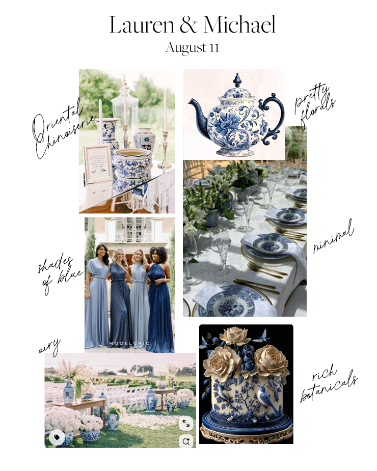
Sample Vision Board for an Oriental Chinoiserie Wedding
But it’s not your fault.
The entire wedding industry is built on showcasing perfection without showing the process.
It teaches you how to copy, not how to create.
Designers show you what they made—but they don’t show you how they made it, or how to make something of your own.
So naturally, you do what’s been modeled: you collect, you copy, and you hope it works.
And because you’re not a designer, all you can do is shop for what’s available and choose from the available options. There is not other choice (well there is, but more on that in a bit.)
What happens when you stop copying and start designing from the inside out:
Build your Vision Translation Board™ before touching any design
Use it to guide font, layout, envelope, and accessory choices
This gives you freedom within alignment
That quiet disconnect? It disappears.
You’re no longer second-guessing every decision because every choice has a root.
Your invitations feel like they belong to your wedding—and your wedding feels like it belongs to you.
When you use the Vision Translation Board™, you’re not just picking fonts and colors.
You’re designing an experience that reflects your relationship, your aesthetic, and your story. It’s not a Pinterest trend.
It’s a wedding that feels like home—to you and everyone who walks in.
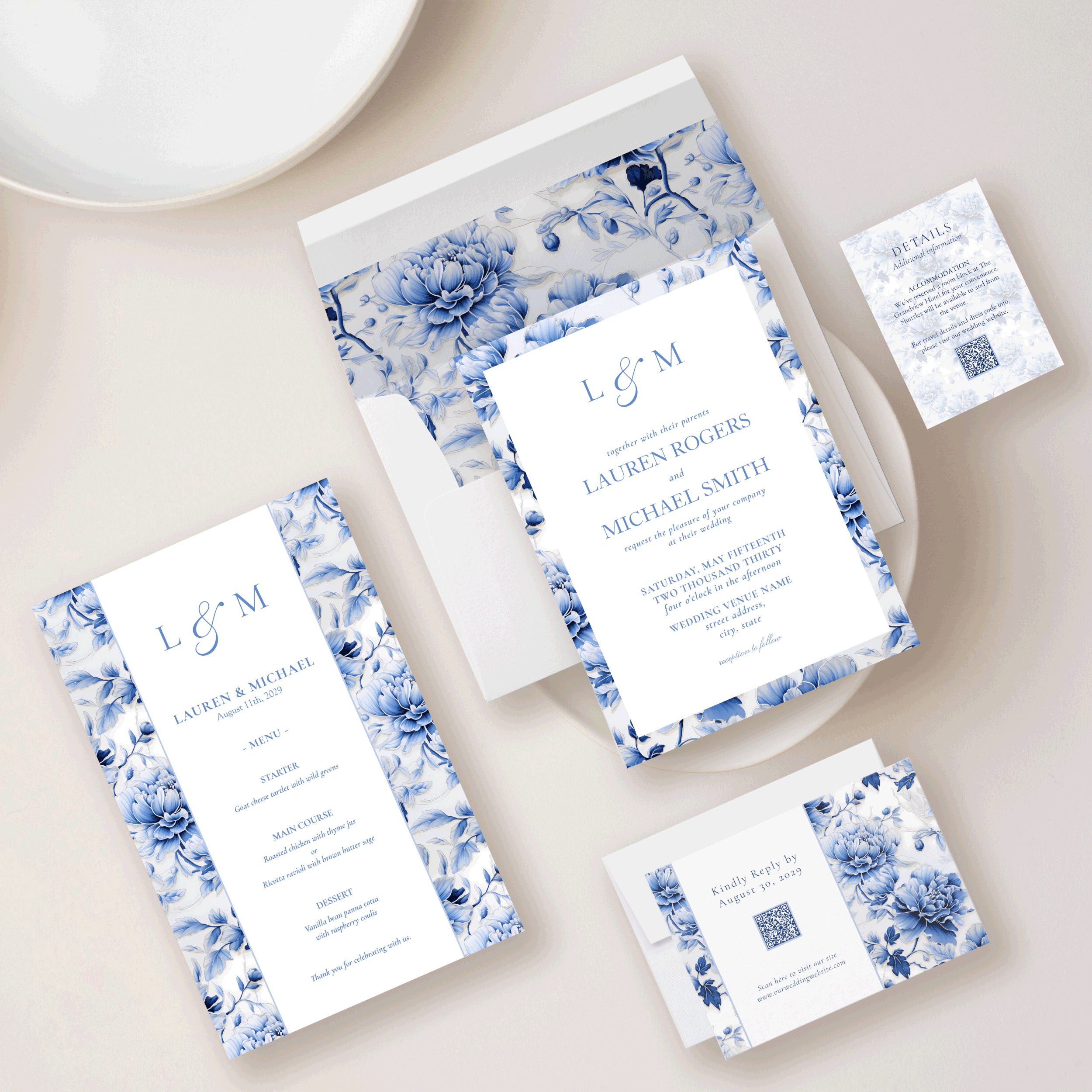
Oriental Chinoiserie Wedding Invitation Suite designed to a vsion
So What Do You Do Instead?
First of all, I want you to know that these mistakes are common. Most designers won’t tell you how to fix them, because it’s not in their interest to empower you.
The truth is, designing a wedding that feels like you doesn’t come from having more options—it comes from having more clarity.
And that’s what the Vision Translation Board™ gives you.
It’s not just a moodboard. It’s a decision-making tool.
Instead of chasing trends, guessing what goes together, or layering elements until it feels “done,” you’ll learn how to filter your ideas into something that’s cohesive, calm, and deeply personal.
Whether you’re DIY’ing your invitations, curating your tablescape, or still in the early stages of gathering inspiration—this is where your vision starts to take shape.
Frequently Asked (and Quietly Worried) Questions
Q: What if I’ve already chosen my invitations? Is it too late to fix the rest?
Not at all. In fact, your invitations can become a guide for the rest of your design decisions—if you take a moment to translate what they’re already saying.
The Vision Translation Board™ helps you reverse-engineer your vision from what you’ve already chosen, so everything else—like signage, tablescapes, and ceremony decor—feels like it belongs. No need to start over. Just begin aligning from here.
Q: Can I still use Chinoiserie even if I’m not having a super formal wedding?
Absolutely! Chinoiserie is less about formality and more about intentional styling. It can be adapted beautifully for garden weddings, vineyard settings, backyard receptions, or even destination events—as long as it’s grounded in a clear vision.
The key is choosing details that echo the tone of your space and story, rather than copying what’s trendy. When you use it well, Chinoiserie becomes a quiet thread—not a costume.
Q: What if I’m not a “designer” bride? Can I really do this on my own?
Yes! But you don’t need a design background to create something beautiful. You just need a clear system—and that’s exactly what the Vision Translation Board™ offers.
It takes what’s already in your head and heart and helps you see it clearly on paper, so you can make confident choices without second-guessing everything. That’s what turns DIY into done well.
Q: How do I know when my vision is “done”?
Actually? You’ll feel it.
Not in a dramatic, movie-montage way—but in a quiet sense of relief. You feel like you’ve come home. Everything feels ‘right.’ Things start to click. The decisions feel easier. You’re no longer chasing new ideas—you’re merely refining the ones that already fit.
A finished vision doesn’t mean everything is designed or finalized. It just means you’re no longer searching for direction. You’re building from alignment, not reaction.
And that’s when the wedding starts to feel like yours.
Grab Your Free Copy
If you’re starting to see how powerful this work is—you’re not wrong.
Inside The Visionary Wedding™ course, we walk you through the exact process of designing your wedding from the inside out… designing a wedding and creating a stationery suite that feels like it was made just for you.
👉 Join the Visionary Wedding™ Course waitlist
👉 Or start with the free Vision Translation Board™—it’s completely free—and it will help you:
Understand what belongs in your aesthetic (and what doesn’t)
Spot design inconsistencies before they show up in your invitations
Make choices faster, with confidence
Set the tone for a wedding that feels true to you
You don’t need to hire a designer to plan your wedding, or design invitations that looks custom.
You just need a system that helps you see clearly.